So, mobile device resolution is a very confusing topic. Because until 2010, everything was logical, increasing the resolution changed the size of everything on the screen: both pictures and fonts and interface elements.
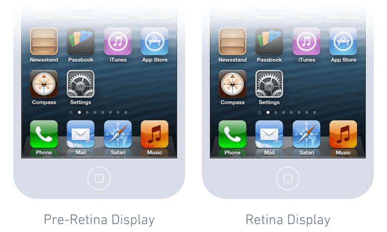
In 2010, Apple introduced a new iPhone with a Retina display, a screen that doubled the number of pixels per inch.


In the above example, the virtual resolution of the devices is the same (320x480px), i.e. if we are making a mobile application or a website, the fonts will remain the same size, the pictures too.
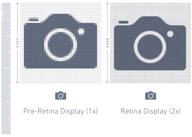
But the physical resolution is different - the second one has twice as much (640x960px) and it will automatically multiply the sizes of all elements by 2 times. And if he can enlarge vector files (fonts, vector pictures), then we need to add pixel pictures ourselves. In this case, in the picture folder for each picture, you need 2 options with a multiplier: 1x and 2x.
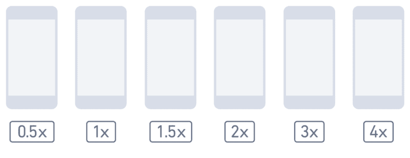
The main problem is that over time, resolutions become larger and pixel densities too (essentially multipliers).


