
Table of contents
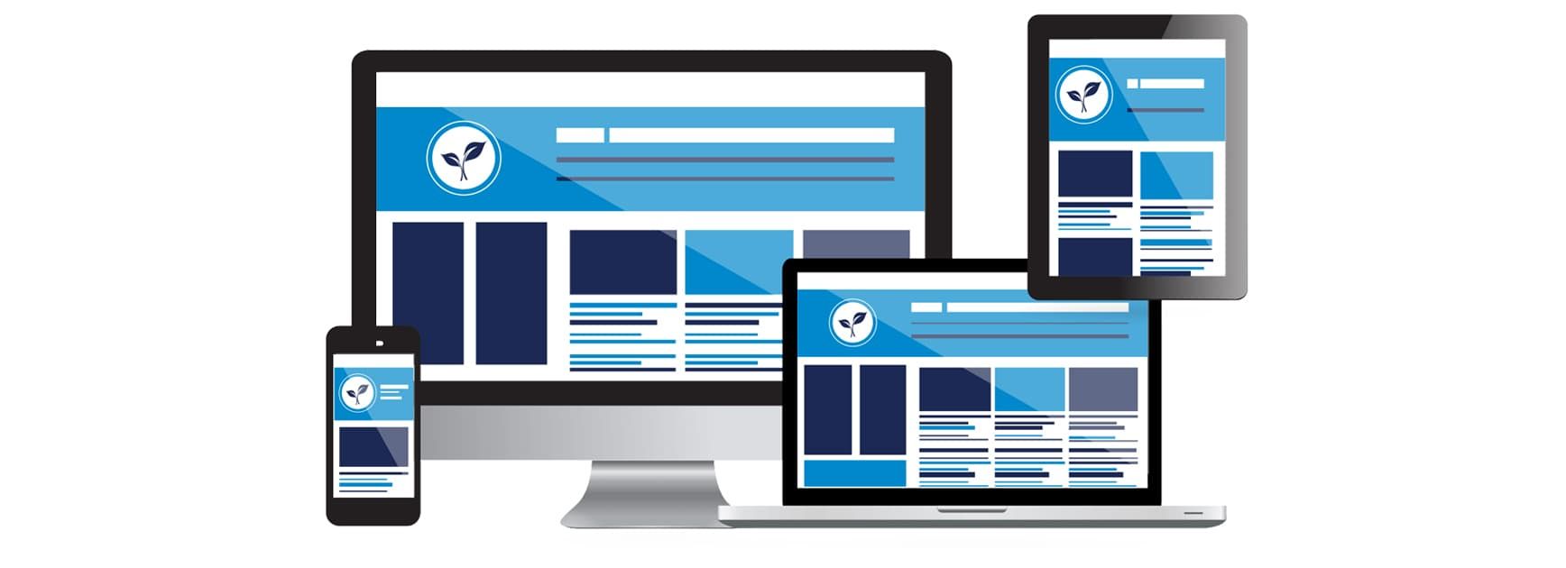
How to adapt the site for mobile devices
29 April 2022
Reading time: 14 minutes
All over the world, Internet traffic from mobile devices has long surpassed desktop traffic. Adaptability for different screens is an essential condition for website building in 2022. Failure to comply with it leads to loss of traffic and lack of conversions.
You yourself have probably come across a situation where it is difficult to make out small print from a smartphone or hit the right button with your finger. Sometimes the very appearance of the site left much to be desired. How to avoid this? We will tell in the article.
Why adapt
- Mobile-friendly ranking
Since 2015, Yandex and Google began to give priority in the issuance of sites adapted for mobile devices. To get to the top, the resource must be “friendly” to mobile users, meet usability standards for screens with low resolution.
- Load speed.
The faster and more correctly a site loads, the better it is treated by users and search engines. Google even introduced special metrics - Core Web Vitals, which reflect the loading time of the main design elements, as well as the stability of the layout. You can check CWV through the Google PageSpeed Insight service.
- Conversion rate.
From an inconvenient and crooked site, you want to leave rather than make purchases on it. Therefore, the conversion directly depends on whether the user finds the desired section or button, whether he likes the design of the product/service card, and whether the resource inspires confidence in general. If this does not happen, the user will simply go to competitors.
- Visitor loyalty
I want to return to a convenient, pleasant site. Repeat conversions are made on it, it is recommended to friends. Accordingly, the company's profit is growing.
- Economy.
Creating a mobile version is cheaper than developing a standalone app.
When to adapt
There are several signs that your site needs to be improved for mobile.
- The page does not fit completely on the screen, and the image has to be shifted to the right or down. This violates the logic of the sequence of blocks and the integrity of the design.
- The layout “shrinks”, the elements become small and the page has to be stretched.
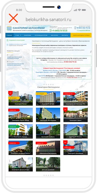
- Pop-up banners cover more than half of the screen. Often, the banner close button remains small and hard to hit.
- The spaces between elements are too small, too large, or simply uneven. This makes the text difficult to read.
- Parts of the design “move out” relative to each other, and sometimes completely overlap neighboring elements.
- A header or filter covers the first screen.
- Buttons and links are too small to be pressed with your finger.
Mobility can also be assessed using the previously mentioned PageSpeed Insight service. It scores from 0 to 100 points. A fairly good indicator is 80 points and above. Yandex offers to check the adaptability of the site in the Webmaster section.
Three ways to adapt
You can present your site on mobile devices in different ways.
Responsive layout
Pages will open at the main address, but with modified content. This technology is implemented in different ways.
- Due to the html viewport tag, which defines the viewport in proportion to the width of the screen. Separately, the styles of the elements are worked out - the number of displayed product cards, the width of the header and the main menu, etc. are adjusted. For this, CSS frameworks are used. The most popular ones are Bootstrap, CSS Media Queries.
- With dynamic JS. Dynamically-served JavaScript allows you to change the content shown to the user depending on the device they are using. First, the html code is loaded from the server (the same for everyone), and then the JS file embedded in it determines what needs to be displayed on the screen. A dynamic script can change the location and size of blocks, remove unnecessary elements.
- Via designer tools. Sites created on well-known designers - like Wix or Tilda - are initially highly adaptive. Individual blocks can be configured to display only on screens with a certain resolution. This is especially true for menus, headers and footers.
Pros of the approach
Relative cheapness and speed of development, ease of website promotion.
Cons
We need to carefully optimize page speed due to the sheer amount of styling in CSS. It is not possible to view the desktop version of the site from the mobile if necessary.
Separate subdomain
For desktop and mobile, two different sites are created - https://www.example.com and https://m.example.com - each with its own content. Using a special command, the server determines the user agent of the user and directs it to the correct version of the resource. For mobile, you can make a page design that is completely different from the desktop one - more functional in the given conditions.
For search engines, two subdomains are two different sites. This must be taken into account when planning and implementing SEO promotion. It is important for online stores to correctly link databases to both subdomains so that changes do not have to be made twice.
Pros of the approach
Complete freedom in terms of layout of the mobile version, the ability to add new functionality. Easier to adapt download speed.
Cons
Creating, administering, promoting a separate subdomain takes time and budget. It is necessary to prevent duplicate content in the search.
Plugins
For most CMS, there are special plugins that replace the site's main theme template if they recognize a transition from a mobile device. On WordPress, the most common solutions are WPtouch or Mobile Pack. The content of the page on desktop and mobile can be either identical or different.
Pros of the approach
Ease of implementation, the ability to modify content.
Cons
Not available for all CMS. The mobile version opens on a subdomain, so there is a problem of duplicate content.
Signs of a good mobile site
- The user spends a minimum of time searching for the necessary information/product/service.
For this, menu, search, sorting of the catalog should be thought out in usability.
- When loaded, the layout assumes a stable shape as quickly as possible.
Among Google's Core Web Vital options is Cumulative Layout Shift. It happens that during the first rendering, the visitor sees the element and tries to click on it. But at this moment, additional loading occurs and the desired element is shifted. This results in a negative user experience that should be avoided.
- Works consistently across devices.
Mobile devices usually mean smartphones and forget about tablets, through which more and more users open websites on the Internet. Another thing to consider is that on small screens there is a vertical and horizontal position, which also needs to be adapted.
- No busting with ads and banners.
This is one of the most annoying factors in website building in general. In mobile versions, it becomes even more serious, because banners take up an already small viewing area, can overlap important design details, and interfere with interaction with interactive elements.
- It is easily indexed by search engines.
In order for users from search engines to get to the site, search robots must first get to it. It is especially important to ensure correct indexing when using subdomains or replacement content.
What to do in practice
- Use buttons instead of links
The recommended size for Android clickable icons is 7mm or 48px. These buttons are comfortable to press with a fingertip. Do not forget about the comfortable distance between the elements.
- Take care of the convenience of filling out forms.
It is important to use the correct input field types - for phone numbers, email addresses, urls or dates. This prevents errors in the transmitted data and generally improves user comfort. For username and password fields, we recommend disabling auto-correction, auto-complete, and auto-capitalization.
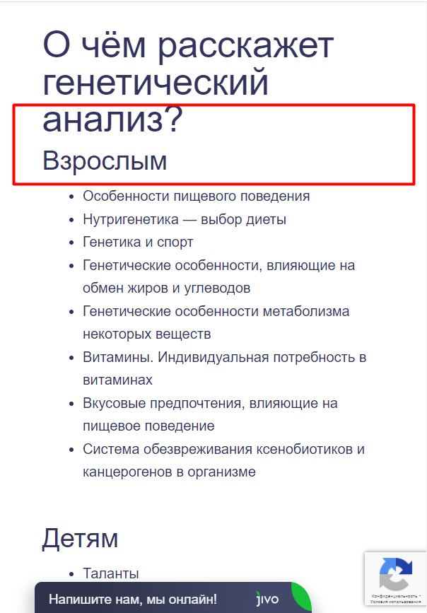
- Make content readable.
Users often browse content on their phone on the go, reading texts diagonally, jumping straight to the part of interest. Keep this in mind when building a mobile UI/UX design:
- highlight semantic sections in the text, write a short informative title for each;
- before sufficiently long texts, place clickable content;
- use numbered and bulleted lists;
- add illustrations and infographics - they additionally structure the content, make it more meaningful;
- use large font - at least 16 points;
- watch the contrast of fonts and backgrounds - find a balance between readability and eye comfort;
- if possible, provide a “night” mode for viewing content on a black background.
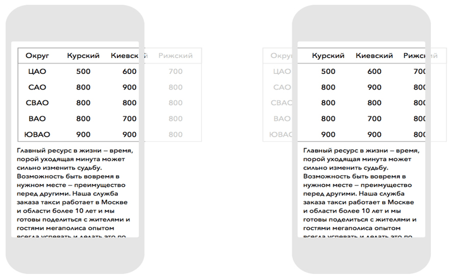
- Add horizontal scrolling to tables.
Tables with more than 2-3 columns won't fit on small screens. This problem is solved by horizontal scrolling via a CSS property - e.g. webkit-overflow-scrolling: touch.
- Adjust the catalog and commercial factors in the online store.
Make sure that filters and sorts open only on click. This saves precious screen space. Optimize the size of photos, buttons in product cards. Determine how many cards to display on one screen when browsing catalog sections. Take care of the shopping cart functionality. Special plugins will help with this - for example, ClickBank.
- Get rid of horizontal page scrolling.
All content must fit within one screen width. Tables are an exception.
- Use geolocation.
With the consent of the user, you can use information about his location to improve the service - displaying pickup addresses, the nearest branches of a cafe or store. To do this, you need to connect the YandexMaps or Google Maps API. Don't forget to test and optimize the speed of the plugin.
Testing
You don't need to have all possible devices and OS versions on hand to thoroughly test the mobile version of your site. Simulators have been developed for this.
- BrowserStack - emulates desktop and mobile browsers;
- Genymotion - suitable for working with the Android system;
- iPhone simulator - for Apple products.
You can also test using Google Chrome's mobile developer mode.
Conclusion
A successful business is a business that matches the trends of its time. Now mobile devices are used to surf the Internet more often than desktop ones. Therefore, website adaptation for smartphones and tablets is a must-have for any company. To make the site user-friendly, it is necessary to optimize the page width and the size of clickable elements, set up the display of tables, catalog filters, product cards. You can adapt to mobile using a subdomain or through setting CSS styles.