Table of contents
Reading time: 14 minutes
Internet marketers, seo-specialists, product managers are fighting for the growth of the website conversion rate. On large projects, a whole team of professionals solves a difficult task - how to make a user buy the proposed product, and preferably more than once. While oversimplifying, the answer can be succinctly and clearly - provide visitors with a human service that will be pleasant to return to. But in practice, such advice can include a myriad of nuances. In this article, we've put together 22 useful tips on how to increase website conversions by making small changes to it. All suggested actions are verified by our own experience.
1. Optimize download speed
Slow website = unhappy visitor. A dissatisfied visitor does not make a purchase. You can check the page loading speed in Yandex.Webmaster or using the Google Page Speed Insight tool. The increase in speed is achieved by optimizing images, shortening CSS code, caching and other technical means.
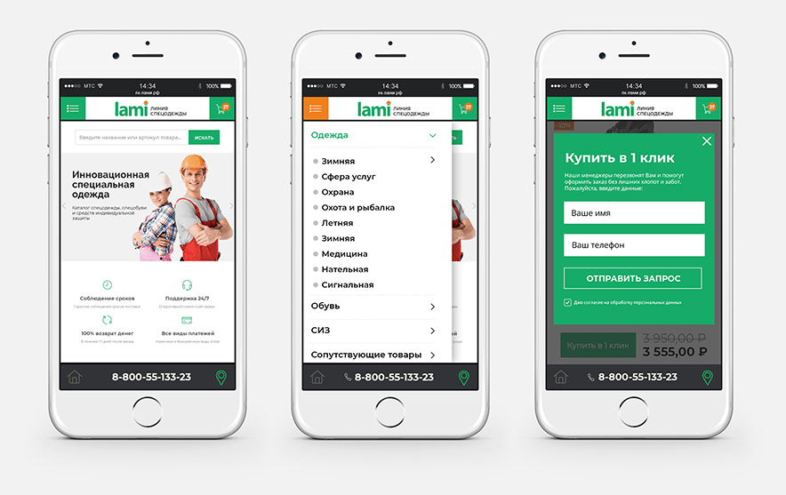
2. Check mobile responsiveness
Yes, the advice seems obvious. But if this were true, then every third site would not have so many display problems on mobile. Most often affected:
- sliders - they can be too big or, conversely, too small, they are often inconvenient to flip through;
- buttons and links not adapted for finger tapping;
- space between text paragraphs, headings and illustrations;
- filters and sorting in directories;
- photos in product cards.
Fixing minor bugs in the mobile version will help to significantly increase the percentage of site conversion without serious revision costs.
3. Conduct a technical audit
Technical flaws, even if they are not noticeable at first glance, can negatively affect the conversion. Broken links, crooked scripts, broken forms - you need to find and fix them in time. Useful audit programs - NetPeak Spider, Screaming Frog, Megaindex online service.
4. Add more communication channels
The telephone and email, as a means of communication, have partially lost their relevance by 2022. Most users have gone to messengers - Telegram, WhatsApp, Viber. Give users the opportunity to contact you in their preferred way. And to make communication with clients in messengers convenient for a manager, connect a CRM system - for example, Bitrix24, or use the jivosite service.
5. Take care of navigation
If the user does not find what he was looking for within 20-30 seconds, he will leave the site. Therefore, the menu - both the main one and the catalog - should be structured, understandable, short. Here are some tips:
- be sure to make a separate page listing the categories - the dropdown menu is not always convenient to use;
- structure blocks - put the most important ones at the top of the list;
- place important links in the footer;
- Use tags - useful for both navigation and SEO.
Separately, it is worth working out the filters and sorting of the catalog. Basic rules:
- There shouldn't be many filtering categories - unless you sell complex industrial equipment or household and computer equipment;
- categories should not contain semantic or complete duplicates;
- when checking the checkboxes, the user should see the number of available product options with the specified parameters;
- avoid "endless scrolling" on category pages - it's better to paginate with a controlled number of cards per page (10, 50,100).
6. Customize your search
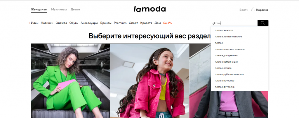
The presence of a search bar is only part of the usability and tools to increase the site's conversion. It is important for the user that the search is convenient. To improve site search:
- configure the output of results, taking into account errors, typos;
- suggest similar options if no product is found by exact match;
- Enable form autocomplete and show suitable options - preferably with pictures.
7. Make it easy to fill out forms
People are inherently lazy. If you need to fill in a lot of fields to buy a product, and then enter a captcha, the probability of a purchase is greatly reduced. Name, phone number, delivery address - this information is enough to place and deliver the order. Even the electronic form field can be made optional.
8. Specify information about delivery and payment
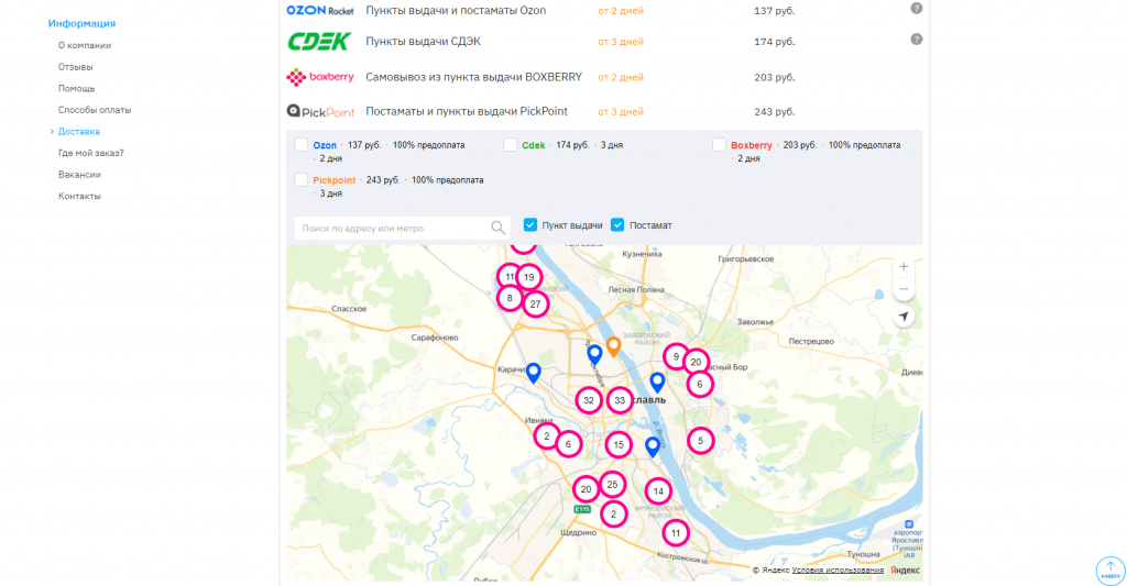
General provisions - available transport companies, terms and price of delivery - it is advisable to indicate directly in the product card. Detailed information is written on a separate page. If your product can be picked up at the pickup point, place a map with pointers on the website.
It is important to specify the terms and conditions for the return of goods. The user is more willing to make a purchase if he has guarantees.
9. Refine product cards
The value of website conversion largely depends on how well the seller manages to “show the product face”. Among the typical mistakes of online stores:
- Fuzzy, small photos that can't be enlarged.
- Incomprehensible descriptions, consisting only of characteristics - centimeters, amperes, hertz, etc. The consumer - especially if the product is in mass demand - needs to explain the properties of the product in an accessible language. Is this speaker loud or average? How many hours will the battery last?
- No reviews or ratings.
- For stores selling clothes and shoes - the lack of explanations for the dimensional grid. Different manufacturers have different sizes indicated by the same number or letter. Therefore, you need to attach a table with metrics to the cards.
10. Specify prices
Yes, many vendors still play guessing games with customers. But nothing good comes of it. Even if the price of the goods is calculated individually, you need to write down its average value, with the appropriate caveat. So the potential buyer will have a reference point. Prices are also an important commercial factor in ranking a site in search engines.
11. Upload more photos and videos
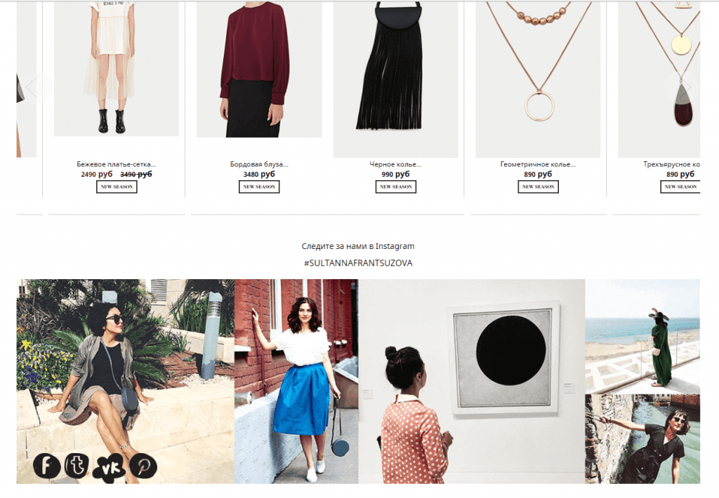
Show the product in action. Post reviews and opinion leaders. Nobody wants to buy a pig in a poke. Before buying, users try to collect as much information about the product as possible, including visual information. So provide it.
12. Let users have their say
Social proof - ratings, written and video reviews - is an important part of the buying decision process. Even the negative aspects of the brand can turn in its direction, carefully working through them - offering a solution to the problem, providing the client with a discount, or simply expressing willingness to cooperate.
It's a good idea to create a platform for generating user-generated content on the site. Yes, you will have to take care of moderation and additional space on the server to store information. But when potential buyers see how your product is useful in practice, or can discuss it with other site visitors, the conversion is likely to increase, as well as the company's reputation.
13. Experiment with widgets
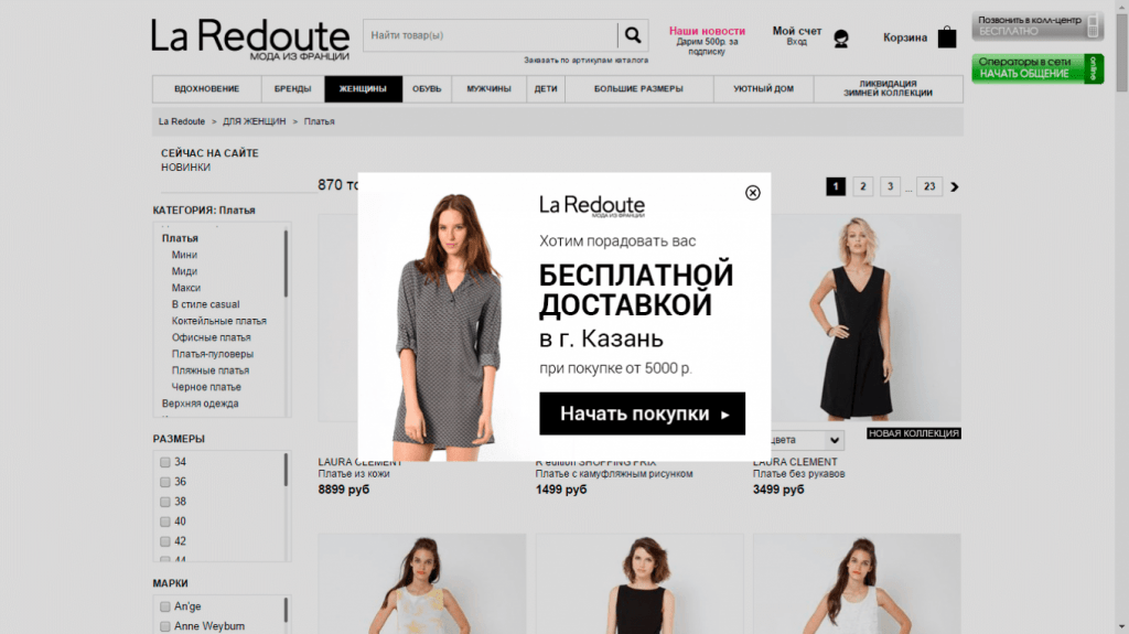
“Everything is poison and everything is medicine; both are determined by the dose,” said Paracelsus. For pop-ups and widgets, this principle applies 100%. Too intrusive pop-up windows that appear out of place scare away users. But a discount offer shown at the right time - for example, when adding a product to "Favorites" - can increase the conversion of the site.
14. Focus on bonuses
Saving is one of the best incentives to buy. Therefore, promotions on the site should be noticeable. But noticeable does not mean intrusive. Highlight the link to the “Sale” section in the menu with a bright color, place the discount banner in the slider on the main page. That's enough.
Conversions are greatly influenced by additional free services. According to a study by marketing agency Walker Sands, almost 90% of customers find free shipping to be an effective purchase motivator.

15. Show results in numbers
A common but still effective technique. If your veterinary clinic has already successfully treated 358 pets, or your workshop has already repaired 563 cars, tell us about it. The main thing is that the indicators are reliable and understandable. If a coffee shop writes about 3170 liters of coffee drunk, this is unlikely to have an effect. Such figures are difficult to verify and compare with those of competitors.
16. Create a sense of urgency
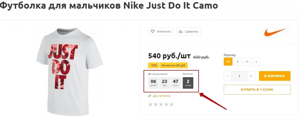
“Sale ends in 3 hours and 23 minutes” is a simple and highly motivating ad. Another technique is to indicate the balance of goods in the warehouse. But for the trick to work, it is important to be honest and not use an endlessly resetting and resuming sale timer. Such manipulations are quickly exposed.
17. Share useful content
Professional blogging not only benefits SEO and brand reputation, but also helps increase website conversions. True, in order for articles to really be useful, you need to follow a number of rules.
- Help the user solve their problems. To find topics for articles like this, all you need to do is parse search queries related to your topic, starting with the words “how”, “how much”, “why”, etc.
- Give visitors unobtrusive advice about the properties of products, features of different models. Help make a choice.
- Entertain. Distracted, non-commercial themes work more indirectly than directly - but still affect the conversion.
18. Work with traffic
Of course, initially motivated visitors are more likely to make a purchase. But improving the quality of traffic is a long and painstaking job. Here it is necessary to work with the semantic core, optimize campaigns in contextual advertising, build a content marketing strategy on external resources.
19. Personalize communication with users
The famous writer Dale Carnegie claimed that a person likes the sound of his name. It's hard to disagree with this. According to a study by The Commerce Shop, 73% of consumers say that personalization increases their level of engagement in the online shopping process.
Offer special discounts based on previously purchased products, add the name of the addressee in the mailing list, set up individual notifications - every online store can do it.
20. “Squeeze” abandoned carts
It is very unpleasant to lose buyers one step away from making a deal. The easiest way to return a client to the site is trigger mailings. The second option is remarketing campaigns in contextual advertising and social networks.
21. Test CTA Buttons
A/B tests help to increase the conversion of the site and the CTR of call-to-action buttons by an average of 3-5%. At high speeds, this is a significant result. The main requirements for CTA buttons are eye-catching color, sufficient size, and catchy content.
22. Update the information in the “About” section
Users look in this section if they want to find confirmation that a company can be trusted. But boring texts like “a team of professionals with many years of experience” do not impress anyone. It is better to be sincere, to talk about your real achievements in numbers. Photos will be a good addition to the story.
Conclusion
The question of how to increase the conversion on the site worries every webmaster. But there is no one size fits all solution. Each resource has its own individual set of measures. Test various changes on the pages, generate content, work with traffic - the goal will be achieved.


