


-
Project time
 6 months
-
Project's budget
 $ 30,769
-
Implementation date
 2021 year
Niyama website 2021
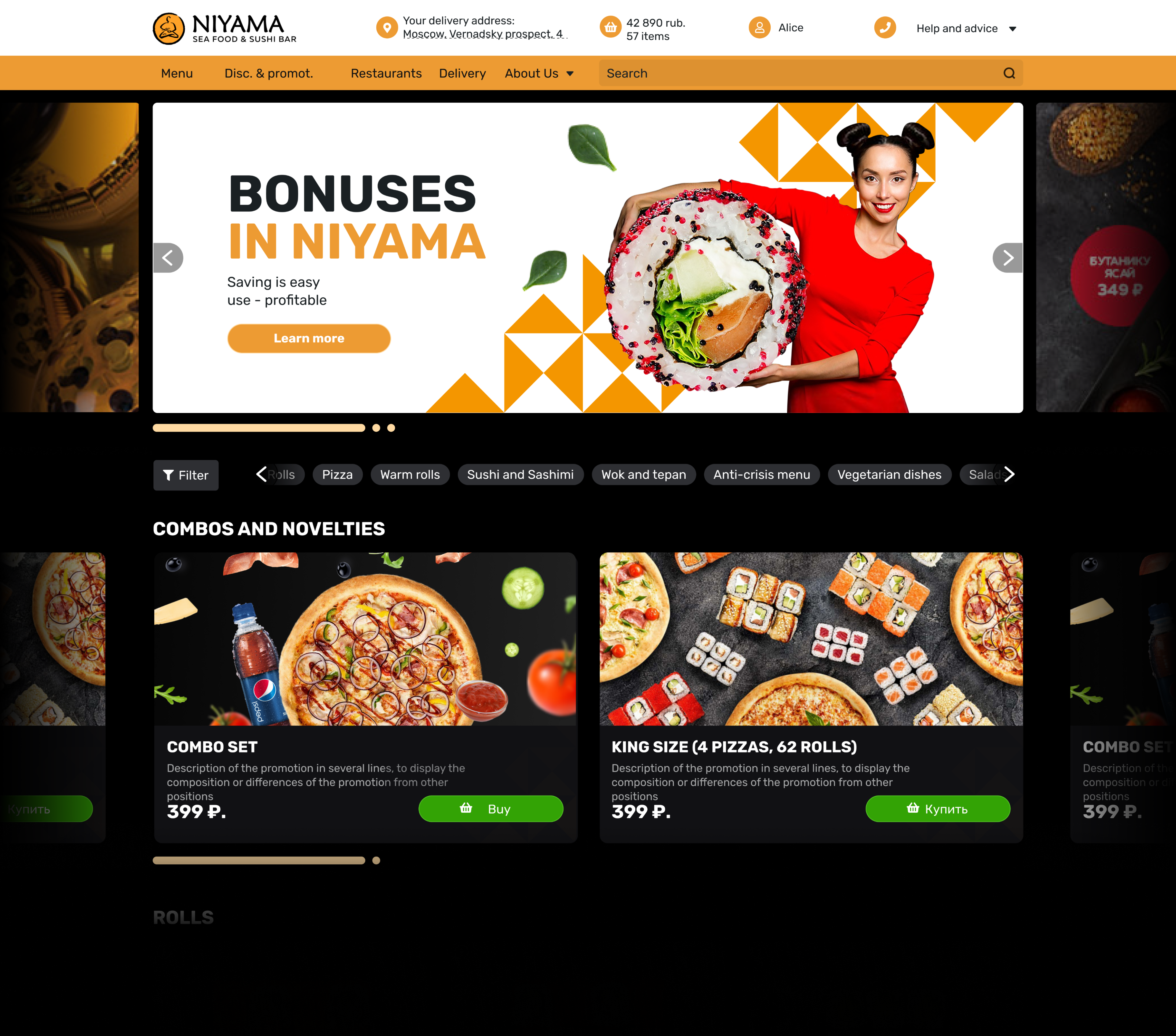
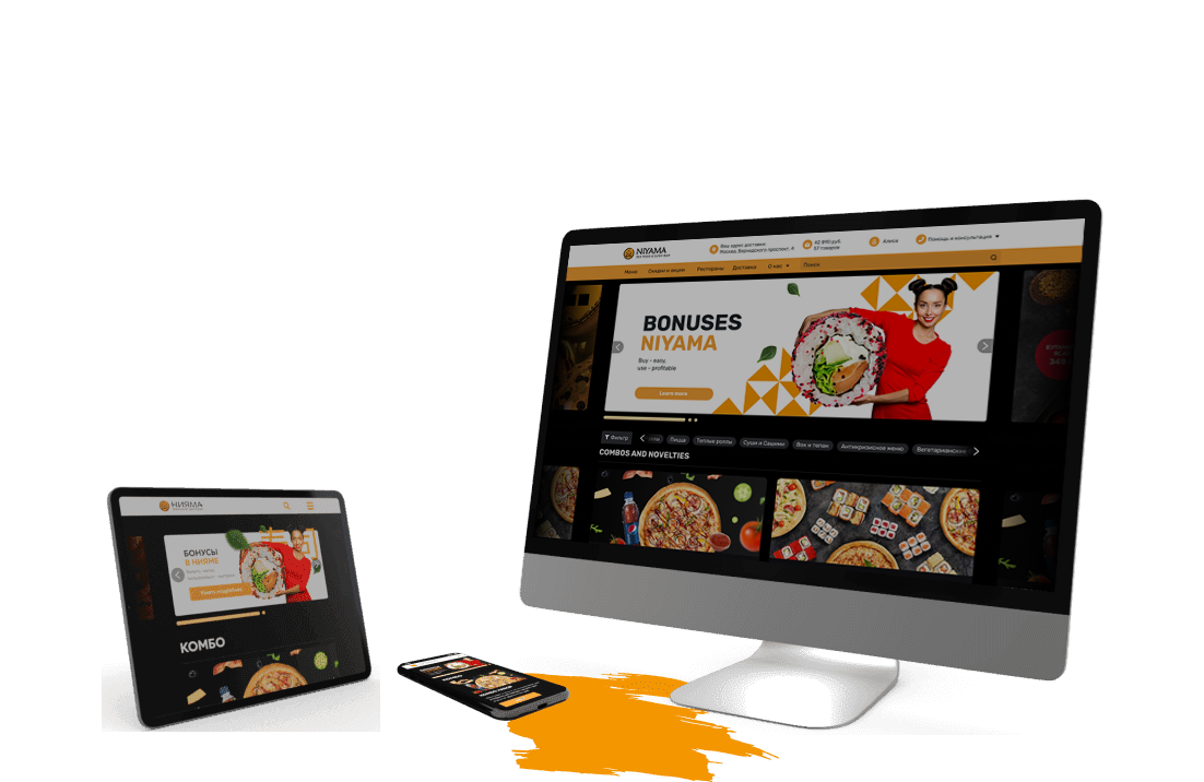
Niyama, a well-known company in Moscow (sushi, rolls), turned to Crocoapps for a redesign of its website in 2021. Modern requirements for UI / UX practically force major players to constantly improve and develop the usability of the site. Indeed, at high rates, even a 5-10% increase in conversion can determine everything.
Technologies
In the course of development, we selected the optimal set of tools, thanks to which we qualitatively and competently completed the tasks of the client:


Color
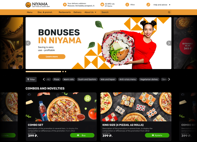
The dark color scheme is the basis of the Niyama company identity. The user of the site has the opportunity to switch to light, familiar colors.
-
ED9B33
-
FFDA2
-
A8A9AA
-
2E2F33
-
1A2023
-
17181D
Apptask and Niyama
In the conditions of dynamic development, any company needs to make decisions as quickly as possible. A modern, powerful and functional CRM - Apptask.ru helps with this. Our studio switched to this service because it allows you to optimize work processes and, as a result, improve the quality of services provided.

User story
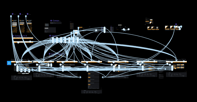
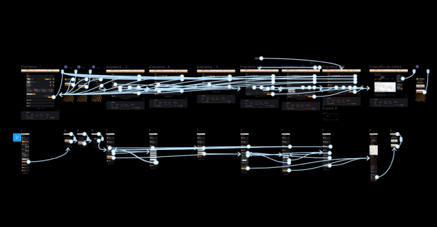
The simplest way for a user from entering the site to receiving the goods in their hands is actually incredibly complex "under the hood".
Cobwebs of interrelations between mechanics, their order of work and the reaction of neighboring verification mechanisms to the results of the previous ones, the “what if” questions that arise in the process and the answers to them were worked out almost half of the time allocated for the development of project documentation.
Company Description
The Niyama restaurant chain was founded in 2003 by Damir Usmanov with the support of his partners. The basis of the business was the main idea - to make very tasty and honest rolls and sushi. Honesty. Taste. Quality is the "three pillars" on which the network of Japanese restaurants "Niyama" was built and still stands to this day.

Interactive
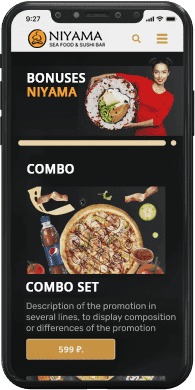
The Niyama website as well as the mobile application are fully interactive. Any interaction with interface elements, whether it is a dish card, a service page or a promotion, will intuitively make it clear what further actions you can take on the site. Well-designed scenarios that the user can get into make it possible to exclude almost any human factor.
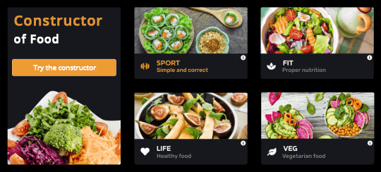
Power Constructor
For the website of the Niyama restaurant chain, our team created a convenient food constructor. The client selects the optimal program for himself, chooses the duration of the meal and calculates the calorie content using the calorie constructor. Several payment methods are available on the site, and a subscription is provided on favorable terms. You can manage your orders through your personal account.
Scope of work
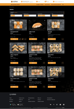
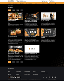
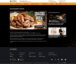
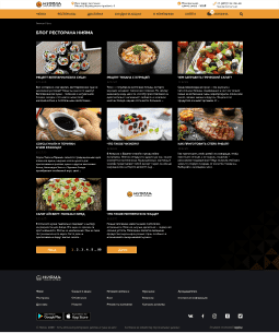
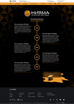
The total number of screens that went into layout is more than 150 positions (with adaptive). Involved two designers for almost three months.

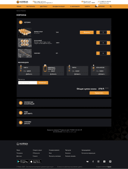
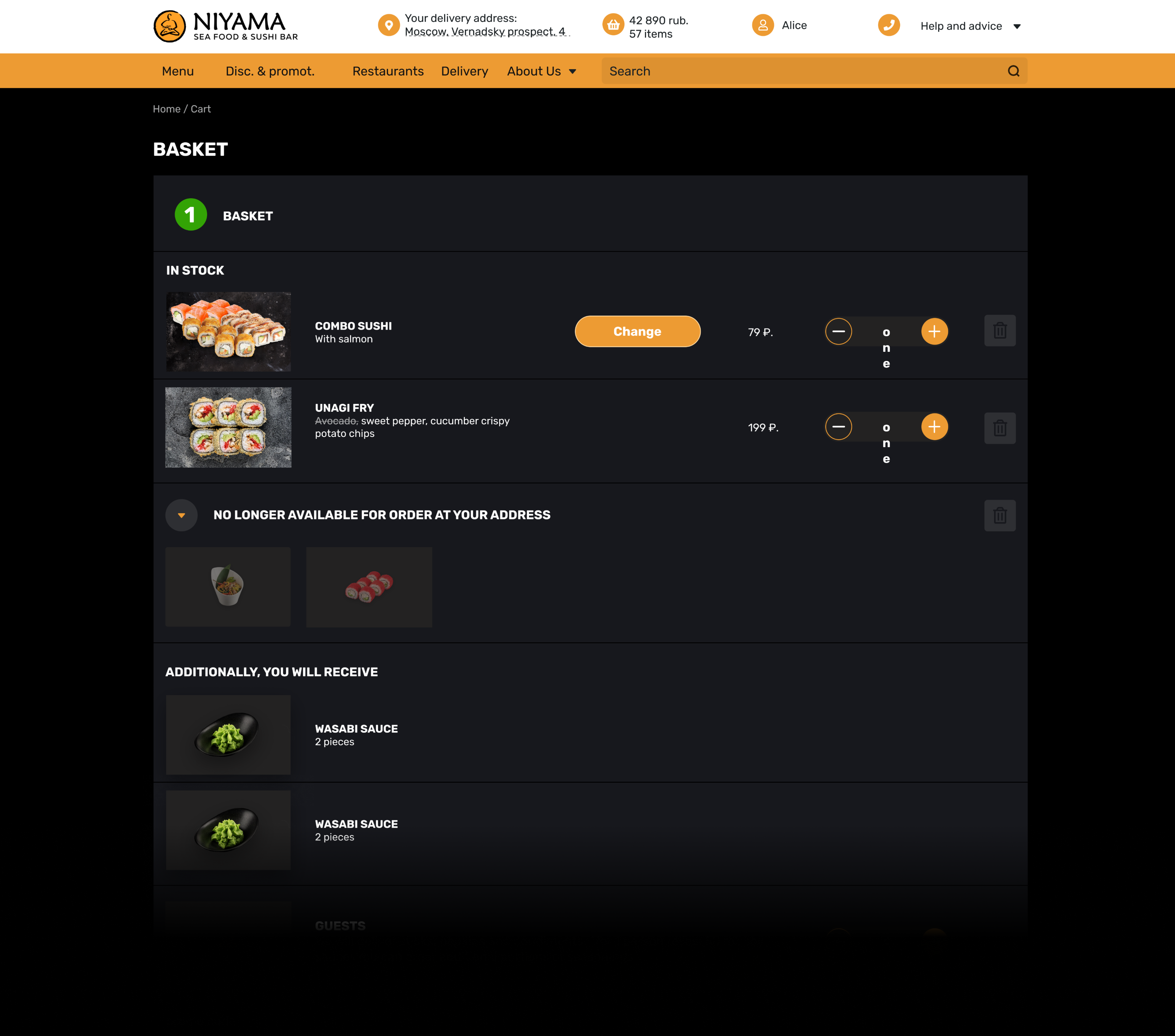
Checkout
We have greatly simplified the ordering process. The goal is to increase the conversion from visit to order. Analytics is still underway, but according to preliminary data, the changes should increase conversion by 10%.

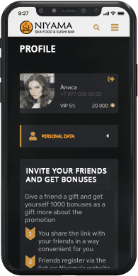
User profile
The most up-to-date user profile in 2021 of all those present in the fast food market in Moscow. Here are elements of gamification, awards and achievements, balls, order history. The most powerful and functional cabinet of all that we have developed.
Was and became
We invite readers to personally see the difference - use the slider on the right.
Visit site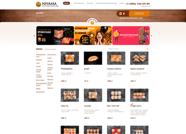


The composition of the project team
Two designers, layout designer, project manager, tester, two programmers
-

Andrey Paly
Chief designer
-

Bohdan Gutenev
PHP programmer
-

Vladislav Tsebinog
2D artist
-

Evgeny Oleinik
QA-engineer
-

Ivan Badikov
Project manager
-

Andrey Radyshevsky
Front end programmer
Interview
What difficulties did you encounter during the implementation of the project?
Our goal was not just to update the site and make it as user-friendly as possible, but also to distinguish the company from competitors, to show its strengths. The main difficulty was that due to the great competition in the market, it was not enough for companies to simply make a quality product, they had to come up with something new and original.
Did you achieve your goal and what tasks did you complete to achieve this?
We think so.
Firstly, we added an interactive application using AR technologies to make it more interesting for the user to use the application.
Secondly, a convenient food constructor was created, where each client can choose and order a suitable diet in a couple of clicks.
Thirdly, we made the user profile interesting and modern: it contains elements of gamification, the client receives awards and achievements, can save and spend points on the next orders.
In addition, the site began to meet all user requirements: modern design, development of a convenient mobile application, the ability to switch the screen mode to different colors and many other features that make the site more user-friendly. This increases the popularity of the brand, which leads to an increase in conversions.

