
Corporate colors and patterns
The combination of black and orange colors helps to focus on the product. The color contrast is especially pronounced in the geometric “tile”. The pattern is clear and recognizable. For the site and for printing, special, more saturated shades are used.


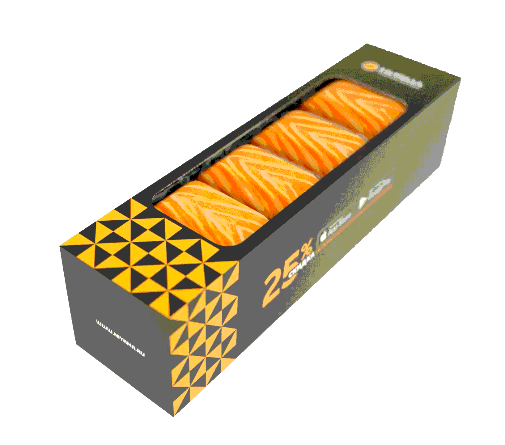
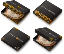
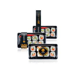
The process of creating packaging for sushi and rolls
For sets of different sizes, up to 7 different design options for branded boxes were created. The tasks of packaging design are to demonstrate the product, to convey important marketing information to the consumer. Demonstration of rolls is carried out using an open window on the lid. Promotions placed on the side walls and links to the restaurant application in the AppStore involve the client in active interaction with the company.

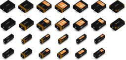
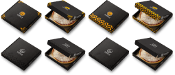
Sushi packaging options
The customer must have a choice. Therefore, we presented him with all 26 developed packaging designs, differing in volume, color scheme and logo type.

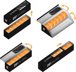
Technical subtleties
The boxes differ not only in appearance, but also in design - from a fully removable lid to a retractable body. There is also a mixed version with an opening in two directions.

Creating the perfect package
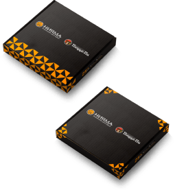
As a result, 8 types of boxes were selected - 4 with color printing plus 4 with color printing and a window. aThe decor contains the necessary marketing elements (promotions, logo, links) and bright patterns. The orange color in the design of the box is associated with one of the main ingredients of sushi and rolls - salmon, as well as with Japanese food in general. The design of the boxes is simple and practical, with a top-opening lid.
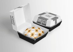
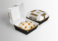

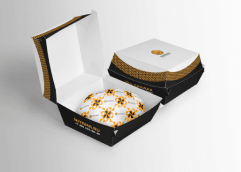
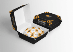

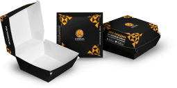
Burger packaging
The burger container has a logo and branded patterns. The same elements are on the wrapper of the dish. Thus, a single, recognizable style is preserved in the packaging. Information about the promotion and links to the application are also present on the box.
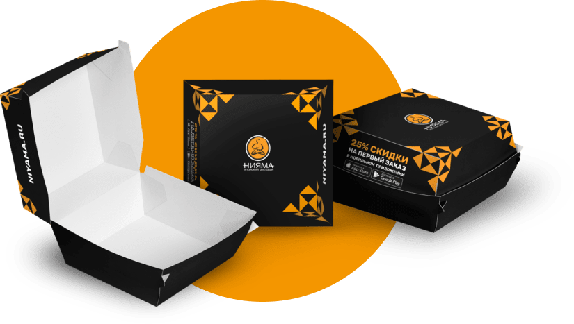
Burgers from Niyama
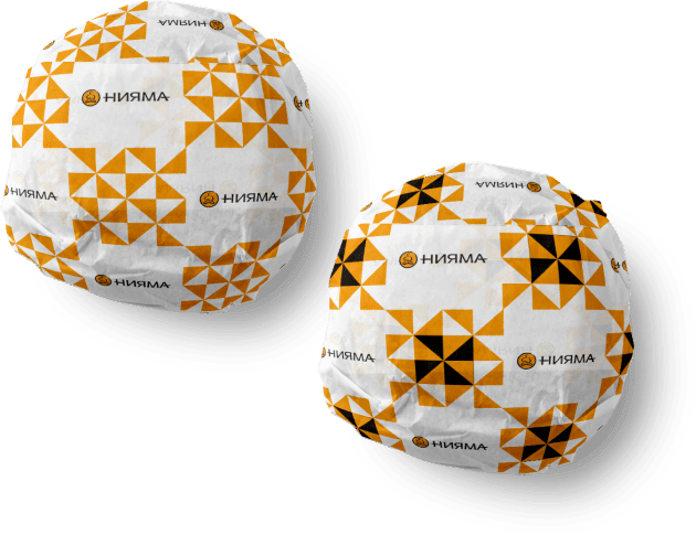
Доставляются в двойной упаковке.
Первая часть - стилизованная оберточная бумага.
Упаковка бургера
На контейнере для бургеров для повышения узнаваемости бренда и представления потребителям продукции используется паттерн и фирменный логотип. Для вовлечения аудитории во взаимодействие на одной из сторон присутствует информация об акции и сайт.

Стиль
Все элементы выдержаны в одной стилистики, легко узнаваемый паттерн и яркий цвет, приятные формы и хороший вкус.


Pizza packaging
For another popular dish, similar boxes have been created in different styles - with variations of the pattern and logo. The main task is to organically place design elements on a wide, flat surface. Some examples are intentionally minimalistic.

Versions
8 types of design, taking into account the design of the box and the features of the corporate identity. In addition to the Niyama company logo, there is a partner logo on the lid.

Design options
When creating a design, it is important to make it practical and consistent with the design features of the package. Based on these requirements, the final version of the box was selected.

Brand collaborations
For pizza produced jointly with partner companies, variants of boxes in different styles were also developed. The main focus remains on Niyama's signature pattern and the general style of the restaurant.
Delivery packaging
Ready meals are delivered to customers in branded plastic containers. This is an important part of maintaining the identity of a company's products.
Designers have worked out all types of containers:
- gravy boats;
- tureens;
- salad bowls;
- hot packaging.
Corporate identity elements are printed on polyethylene stickers to simplify production. For soup tureens, the design is provided not only on the lid, but also on the entire surface.
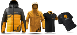
About clothes
The courier is the face of the company. Therefore, the outerwear of the courier service employees is decorated in corporate colors.
Niyama chain branded clothing for the delivery department.
Designers have worked out stylish jackets, windbreakers, polo shirts and T-shirts for employees.


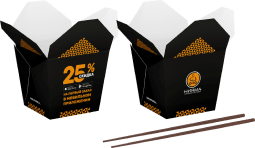
Box for noodles "WOK"
Cardboard packaging for noodles, salads, Chinese and Japanese dishes. Made in two versions. Corporate colors are present.
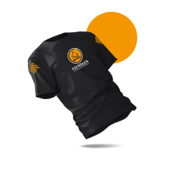
T-shirt
The well-known expression “meet by clothes” is fully applicable to catering establishments. so we designed the uniforms of the employees. For couriers - a black branded T-shirt with a logo.
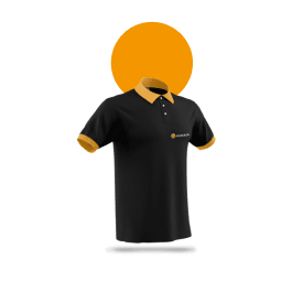
Shirt
Restaurant employees wear stylish black polo shirts with the company logo, orange collar and sleeve piping. Laconic solution in corporate colors.
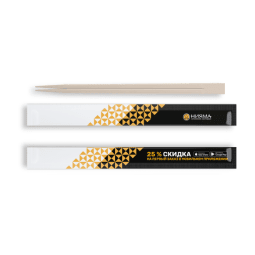
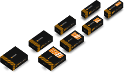
sticks
Traditional Asian cutlery is also part of the brand. Therefore, packaging in black, white and orange colors has been developed for them. Part of the space on the packaging is reserved for marketing information.
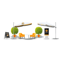
Summer cafe furniture
The summer cafe and the entrance area of the restaurant are an important image element of the establishment. They should be executed in a single key and attract the attention of passers-by.
For "Niyama" were designed:
- pole;
- decorative fencing;
- roll-up;
- two versions of a tent - an umbrella-like awning;
- orange chairs.
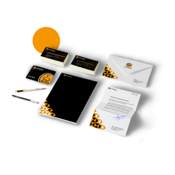
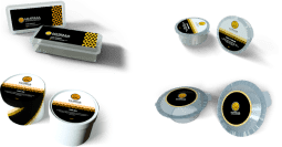
Souvenir and office products
Branded consumables are part of the cafe's PR strategy. For gifts to partners and for use within the company, designers have prepared:
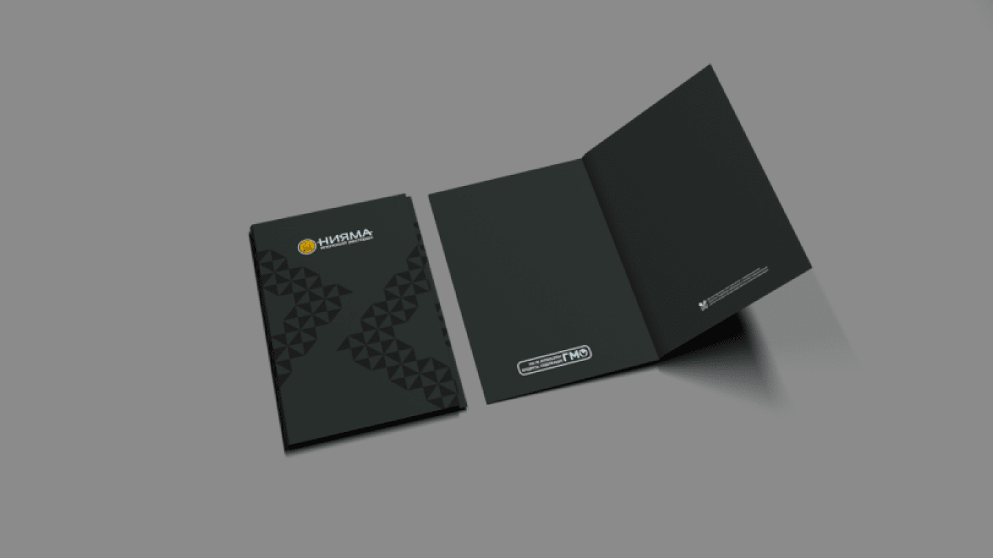
- folder for A4 documents;
- letterhead A4;
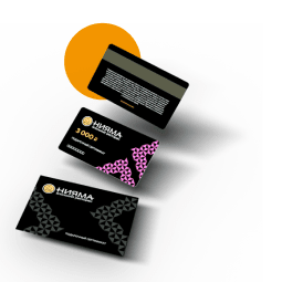
- Discount card;
- DL envelope;
- business cards.
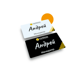
Badge
For the staff of the cafe, branded badges have been developed in different colors with a logo, the name of the employee and the position. The presence of badges for employees makes the institution more friendly and open to visitors.
Cardholder and gift certificates
The gift must be beautiful. Therefore, a special design was created for gift cards and envelopes - with bright colors and stylish shapes.
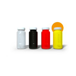
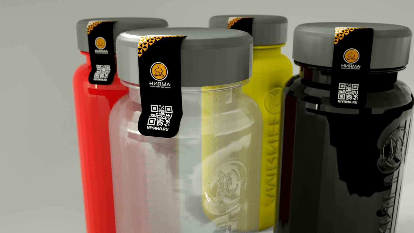
bottles
Minimalistic branded plastic bottles in rich colors, with a thermal rise effect for the inscription and logo. Used to transport cold drinks. Perhaps the most eye-catching design in the line.
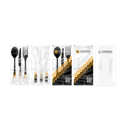
Cutlery
Both the forks, spoons and knives themselves, as well as their packaging, are decorated in the corporate style. In total, 4 wrapper options have been developed - from completely transparent to matte. There is a qr-code on the packages with a link to the restaurant's website.
Containers
Plastic containers for rolls and other dishes. With a branded sticker on the lid and a tape that reduces the risk of opening the package. The type of sticker depends on the dish.

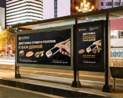
Outdoor advertising
All formats of advertising stands have been worked out:
- lightbox;
- billboard;
- citybox;
- sawmill.
Advertising on the street should be bright and eye-catching so that potential visitors to the cafe will notice it among the general visual noise. At the same time, the main message should be short and clear.

Roll-up
This stand is located directly at the entrance to the cafe and serves as the first point of interaction between the cafe and the client. It contains basic information about the organization, product features, ongoing promotions.


Automobile
The courier's car serves as an additional billboard for the cafe. It stands out on the road, attracts the attention of drivers in the stream. Elements of corporate identity are placed on the hood, bumper, on the sides of the car.

Состав проектной команды
Тверской холдинг «Афанасий» — одно из немногих действительно самостоятельных отечественных предприятий. В своей работе «Афанасий» сохраняет и продолжает лучшие традиции

Yuri Umanets
Project manager

Andrey Paly
UI/UX designer (Art lead)
Technologies
In the course of development, we selected the optimal set of tools, thanks to which the client's tasks were completed quickly and competently. An important role in planning and controlling design tasks was played by the company's built-in task tracker - AppTask.


